Retention
How the Bunny Retention dashboard measures churn rate, net and gross revenue retention (NRR and GRR), and revenue cohorts.
The Retention dashboard gives you different ways of look at your customer and revenue retention.
- Churn rate
- NRR and GRR
- Cohorts
Each view gives you different insights.
Churn rate
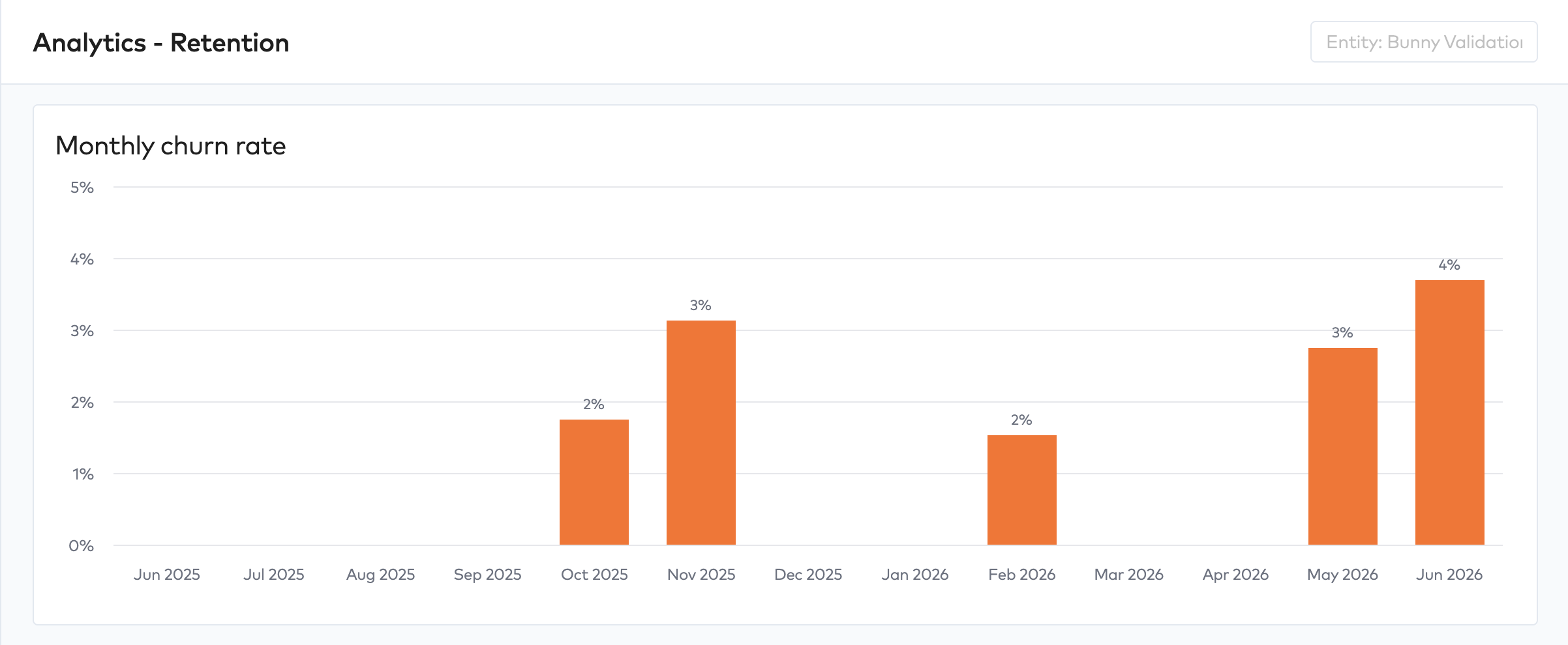
Churn rate measures the rate at which you’re losing customers over a given period.
NRR and GRR
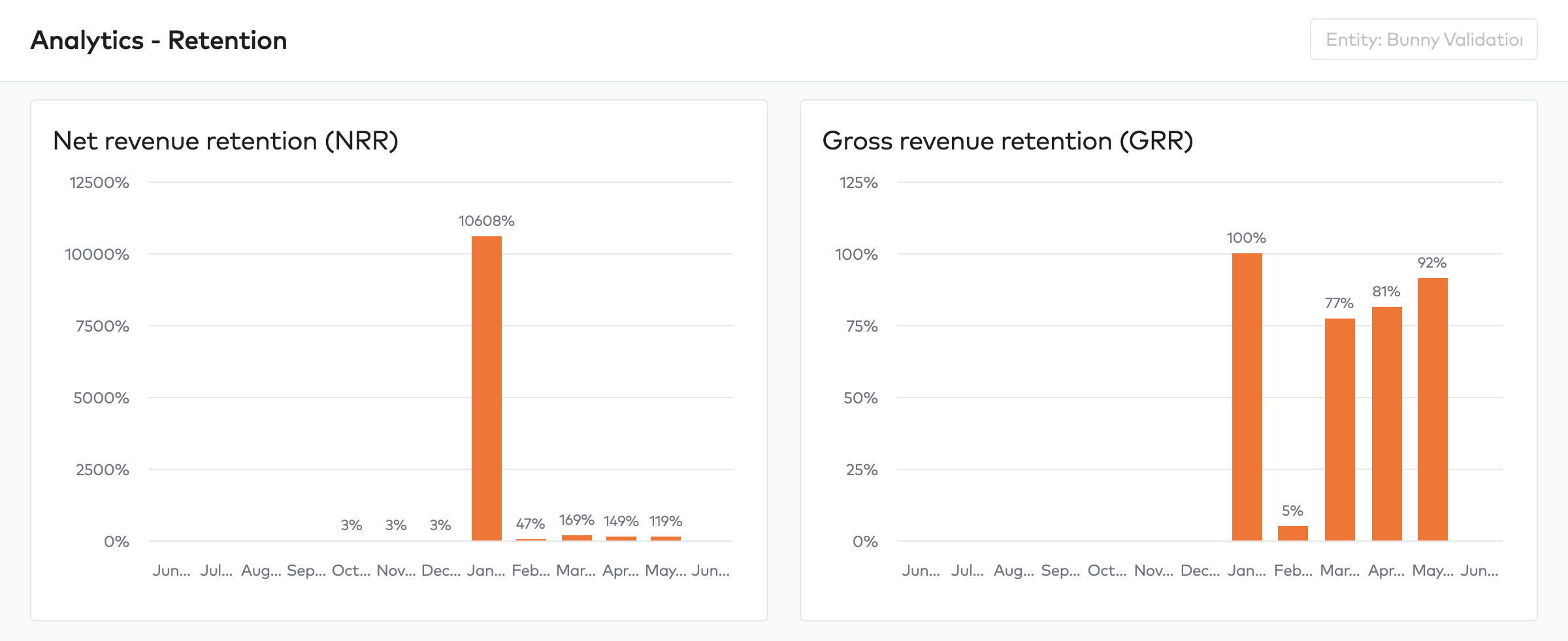
Gross Revenue Retention (GRR) and Net Revenue Retention (NRR) both measure how well you retain revenue from your existing customer base over a period — typically 12 months. They differ in what they include.
GRR only looks at revenue lost. It asks: of the ARR you had at the start of the period, how much did you keep, ignoring any growth from those same customers?
GRR = (Opening ARR − Churn − Contraction) / Opening ARR
GRR is capped at 100% by definition — you can’t retain more than you started with. A strong GRR (>90% for mid-market, >95% for enterprise) means your core revenue base is sticky.
NRR adds expansion back in. It asks: of the ARR you had at the start of the period, where did you end up after all movements — including upsells, downgrades, and churn?
NRR = (Opening ARR − Churn − Contraction + Expansion) / Opening ARR
NRR can exceed 100%, which is the holy grail — it means your existing customers are growing faster than you’re losing revenue. Best-in-class SaaS businesses have run NRR above 130%.
Cohorts
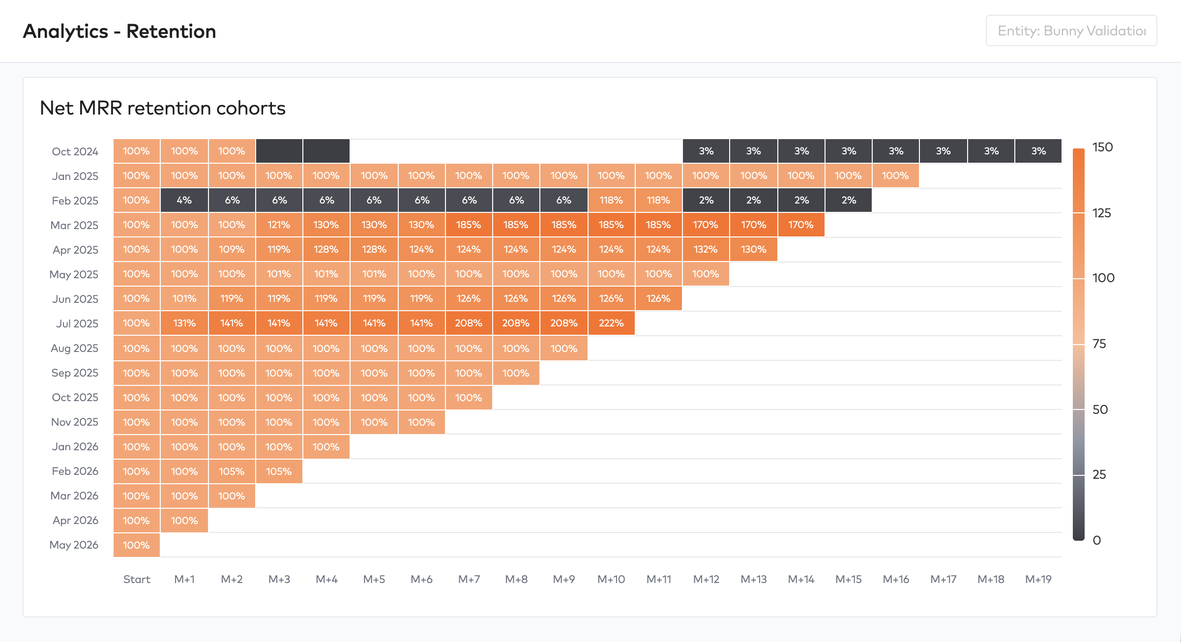
Customer cohorts group customers by when they first signed, then track how their collective revenue evolves over time. It’s the most honest way to see retention and expansion behavior because it strips out the noise of new customer growth.
How it works
Take every customer who started in, say, Q1 2024. At the end of that quarter their combined ARR is your cohort’s starting value — call it 100%. Each subsequent quarter you measure what that same group of customers is worth as a percentage of that starting value.
| Quarter | Q1 2024 | Q2 2024 | Q3 2024 | Q4 2024 | Q1 2025 |
|---|---|---|---|---|---|
| Q1 2024 cohort | 100% | 95% | 98% | 107% | 112% |
| Q2 2024 cohort | 100% | 92% | 95% | 101% | |
| Q3 2024 cohort | 100% | 88% | 90% |
This produces the classic cohort heatmap — rows are cohorts, columns are periods of age. Healthy businesses show values that stabilize and ideally climb above 100% over time.